My place (As promised!)April 03, 2019 at 17:04
Well, well, well... The spring Here! Only few days since then, and we're starting to notice the changes! Sun shines brighter and rain falls heavier!
If you're a TL;DR person I recommend you to skip over to the "some closeups " part.
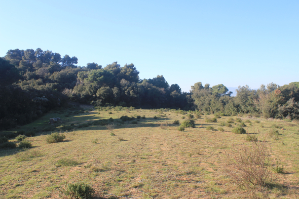
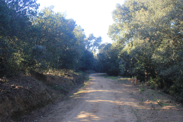
One thing I'm noticing from those two pictures is that the blue of the sky leaks to the elements on the ground (Were the lenses dirty?), like if the sky was glowing...
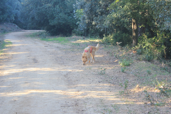
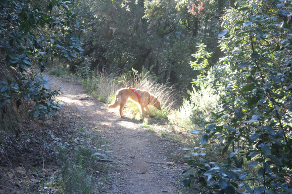
Ha! Who's there? A doggo in the way!
So I changed the mode
After changing to full automatic (The mode was "Landscape"), that pesky glow vanishes.
But the picture is burned!!! Too much white for my liking. At this point, I'm not sure how to make it look nicer, or even if there's the option. Who knows, maybe the image is too burnt for any software to repair.
I'll find out the next week.
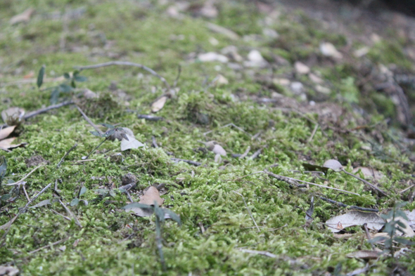
Do you like the moss?
Here, have some moss:
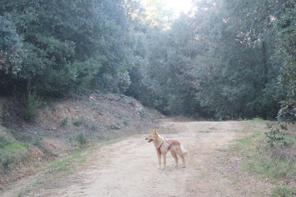
And of course, the star of the show!
As you might notice, the image shows strange, more saturated of colors but also somehow blurred.
After zooming a little, I've found that there's some grain:
Sadly, the light maybe was too dim in that area, so the poor camera had to amplify the signal, causing this noisy grain.
Some closeups
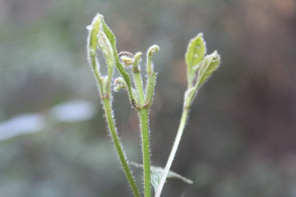
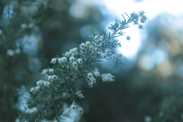
I did picture out some close-ups of plants and stuff (Well, you've seen the moss already!).
And another one, changing the way the camera takes the light:
So, the light really reacts differently in both pictures, the color changes drastically yet they were taken in the same place and at the same moment.
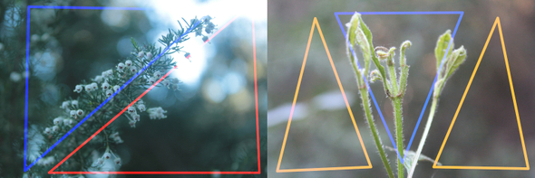
Is like black magic! And talking about black magic, I've tried to do those specially with some "Picture planning", although they might be wrong. As you might now by now, I'm trying to get closer to the artistic world, but for me is like black magic.
So, here is what I'm talking about, I've tried to place the objects in the scene in a way that does not get "Unbalanced", I don't even know if that term exists but I've heard of it:
So, at least when I did the session gave me the impression of balance. (Maybe my "me" of the future will be banging his head against the desk).
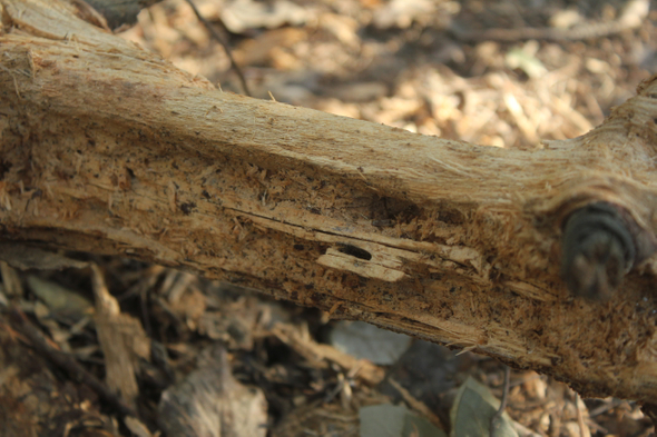
That one is more like "Oh look! Some cool wood on the floor! Let's take a picture of it", but seemed cool:
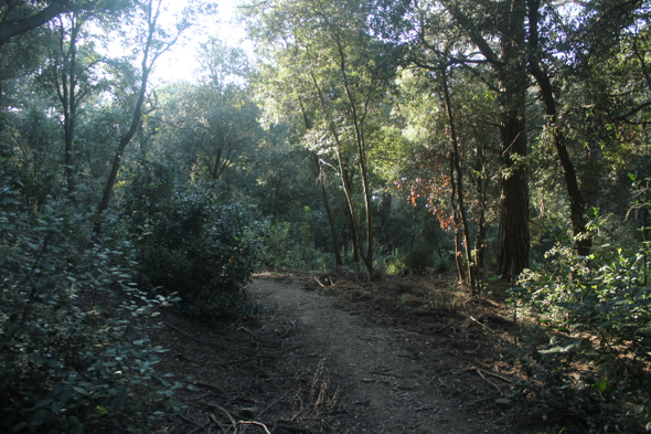
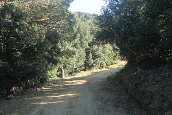
And the place from where those pictures were taken! I like this one specially, I find that colors and light look prettier here. Disclaimer: I have no clue of how I should take pictures from landscapes, as you might have noticed by now.
Another picture from nearby:
And only with time and patience, I'll reach some illumination. Said that, I'm planning to buy some books, in fact I've already bought two about game development, but I'll buy some about art (specially about picture and filming, but I want to begin with general concepts and senses of art).
