
Getting started in painting!December 03, 2018 at 10:12
Well... Here we are again! And as I promised, here you have: The first post that contains artistic work.
I'm just getting started into digital painting (I suppose that it's called like that, or isn't?).
A year ago (More or less...) my girlfriend's mother bought a graphic tablet for drawing in her PC. The problem is that her hands tremble a little, and stopped using it. Then she thought that I could use it, so the money was not wasted, and that is how I've acquired it.
The model is a Wacom Intuos PT S, here have a picture:

(Um... yeah, the messy background is my desk... 😓) And with that beauty, I'm just getting started with my Art journey (I have to confess that scares me a little!).
So here comes the actual stuff! My very first practice in the matter of value painting! I've drawn a picture in gray scale just representing the value of the painting:
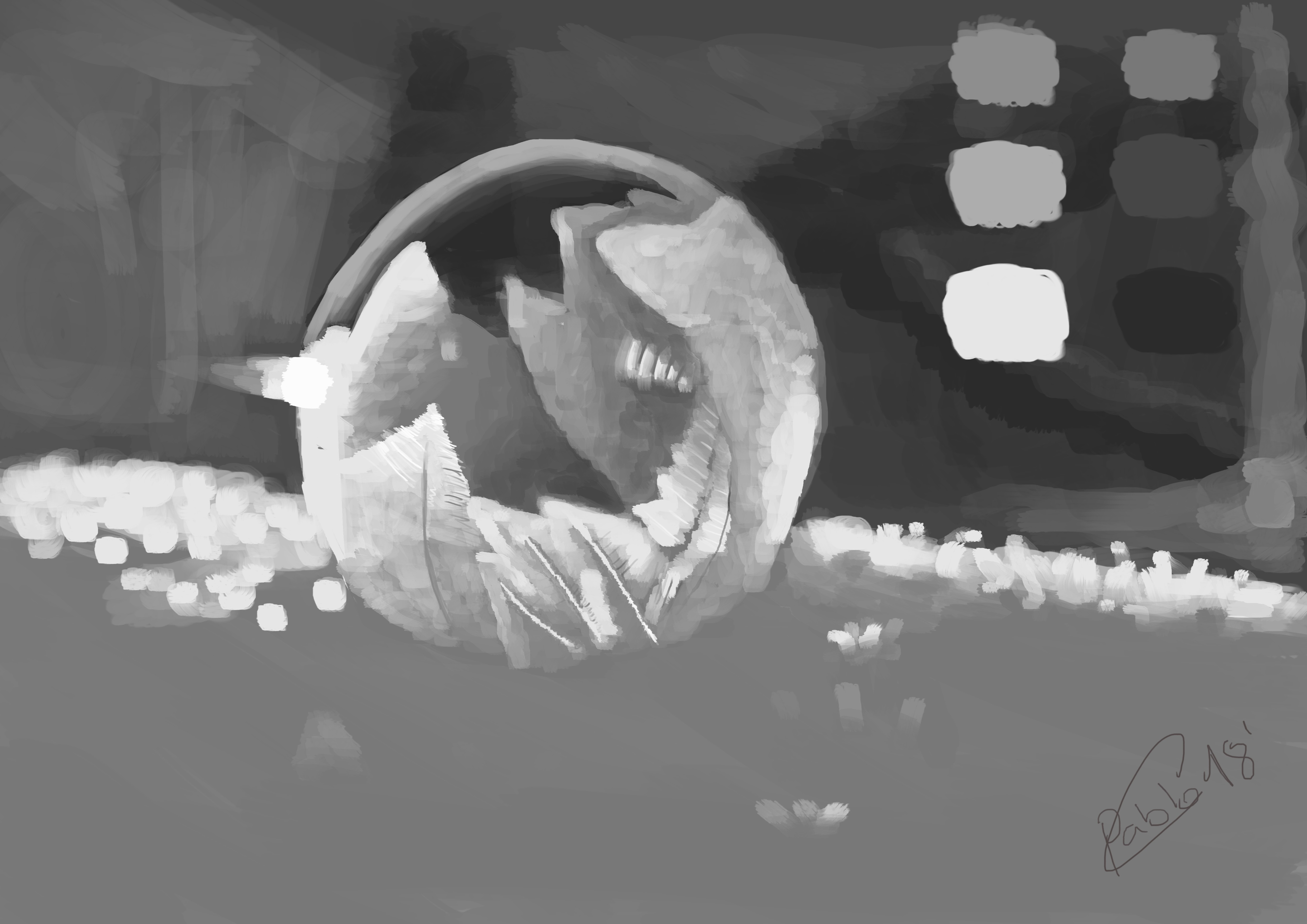
As you can see, there is no colour at all. I've done that because I've read on the internet that is easier to draw the value without the colour because the perception of value may be different for different colours.
By the way, a finer (Don't expect ultra high definition tho!) resolution version is uploaded at my instagram.
Time to compare it with the original 😅!

As you can see, the shape is not very... hum... accurate...
The original obviously displays a perfect bubble while mine, well, a rounded potato. But no problem here, as what I'm really trying to mimic is the light value in itself.
Tones...?
Some time ago, I read in some random blog (or somewhere) that:
Your lightest shadows must be darker than your darkest lights. Some random one
And since, I've tried to stick to that idea. A quick note: All that was done some time ago, so I cannot remember the original sources, from now on, each time I learn something new I'll try to share the sources!
And one problem that I have, is usually that I don't know how to distinguish between light and shadow when it comes to mid tones.
Here you have the "Light and shadow" palette that I've used:

As you can see I've marked the two closer mid tones from light and shadows. This is because I want to ask you if you find those tones too close, or they're right as they are?
I've followed the rule of the light and shadows (They're not the same colour). In fact, the lightest shadow is a little bit darker than the darkest light, but I don't know if they're too similar.
Another thing that I don't know if I'm doing right is choosing the tones. Here I've picked them randomly, just because they fitted. Is there any rule?
So what do you think? let me know in the comments and thanks for reading!
Final notes
By the way, I didn't had implemented the look and feel of the cites, I had to implement it while writing this post. In the following posts I'll make a quick tutorial about it.